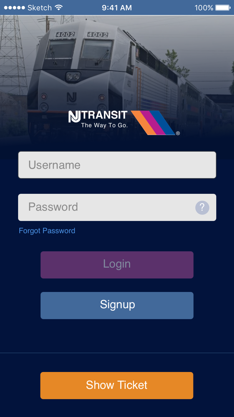
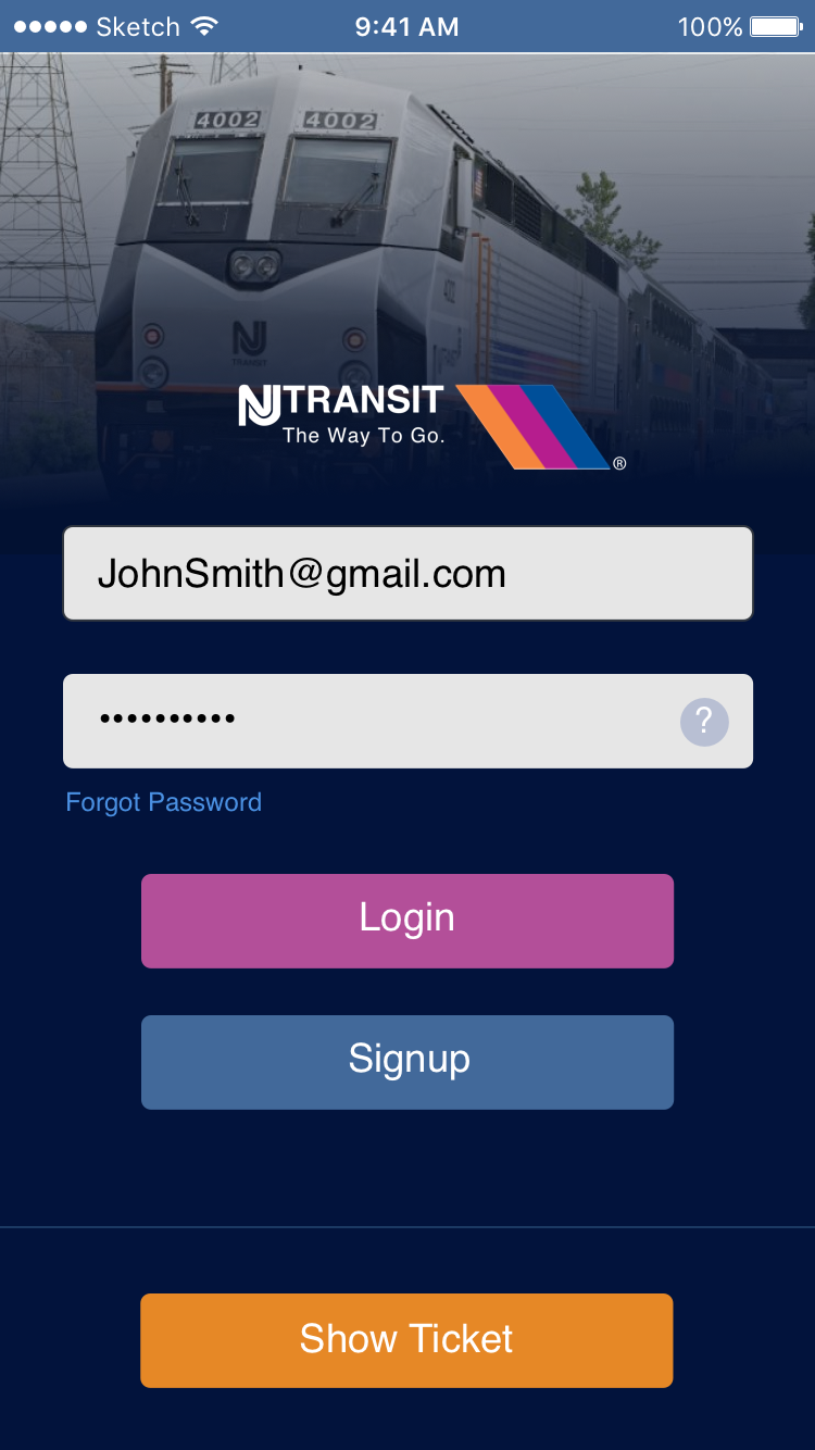
NJ TRANSIT APP
Transit App
NEW JERSEY TRANSIT APP
New Jersey Transit has over a million daily commuters. With technology moving vastly forward, our technology for a simple ticketing system was outdated and not functional.
Customer Insights & Ideation
Speaking with several commuters, I identified the pain points of what made the app frustrating to use.
Strategy & Vision
I created prototypes to share the vision, design principles,
and content strategy. This helped drive decision making.
Testing
To vet the design I had them testing on various User testing websites.
Design Execution & Validation
I designed for iOS . I executed journey maps, high fidelity wireframes, and prototypes
The Challenge
Allow Commuters to Pay and Access Tickets for their Daily Commuting
Since the launch of NJ Transit App, it's had many problems and hasn't had many major updates to the user experience.
My challenge was to figure out a simplified way to have commuters access, purchase, and show their tickets to conductors.
With a new design my goal was to make sure visually, users can see where they needed to go and have some systematic flow from signing in, to purchasing, and
re-buying tickets.
re-buying tickets.
The Approach
From the Ground Up
Being tasked to design the app from scratch I had to figure out a way to have a universal purchasing system based on the physical ticketing system. NJ transit bases price on distance.
What's already known.
1. NJ Transit has thousands of daily commuter.
2. Commuters either use the App or Physical Ticket
3. If you don't have a ticket you'll have to pay the conductor a surcharge on top of destination price.
The basis of these things helped with foundation of the design.
The Commuters
User Case
After figuring out the approach, the next question
was thinking of the users. What's the age range of commuters? What are the main functionalities of
their habits?
was thinking of the users. What's the age range of commuters? What are the main functionalities of
their habits?
Age Range: 20-60 Years Old
Purpose: 90% Commuting to work 10% Leisure (aka, Tourists, Transportation to airport).
Habits: Purchase ticketing, Check for Alerts, Scheduling, Trip Planning
The Discovery
Customer Insight
I conducted marketing and customer research, this also helped drive the design.
Purchasing
One of the main reasons users use the app over regular tickets, is the hassle of purchasing from a booth, getting a surcharge on board, or dealing with human error.
Time
Unlike the European countries transit systems, NJ transit has a small window of catching a train. This includes, stress of missing a train, delays, arriving to the station earlier with intent to purchase a physical ticket.
Scheduling
I found users prefer to have a schedule of all train times at their finger tips. Usually, you would have to go to NJ transits website to look up schedules, alerts, and even have a physical printed time table which is incredibly difficult to read.
The Solution
A Functional App
The vision I had was to build a functional app for transit commuters to access the information they need while commuting.
I did not just want to offer an app to purchase a ticket and let it be done, but an app users can plan, be alerted, and interact with on their daily commuting basis.
Reliability is what I wanted commuters to be conscience of when using or thinking of the application.
The Study
User Testing
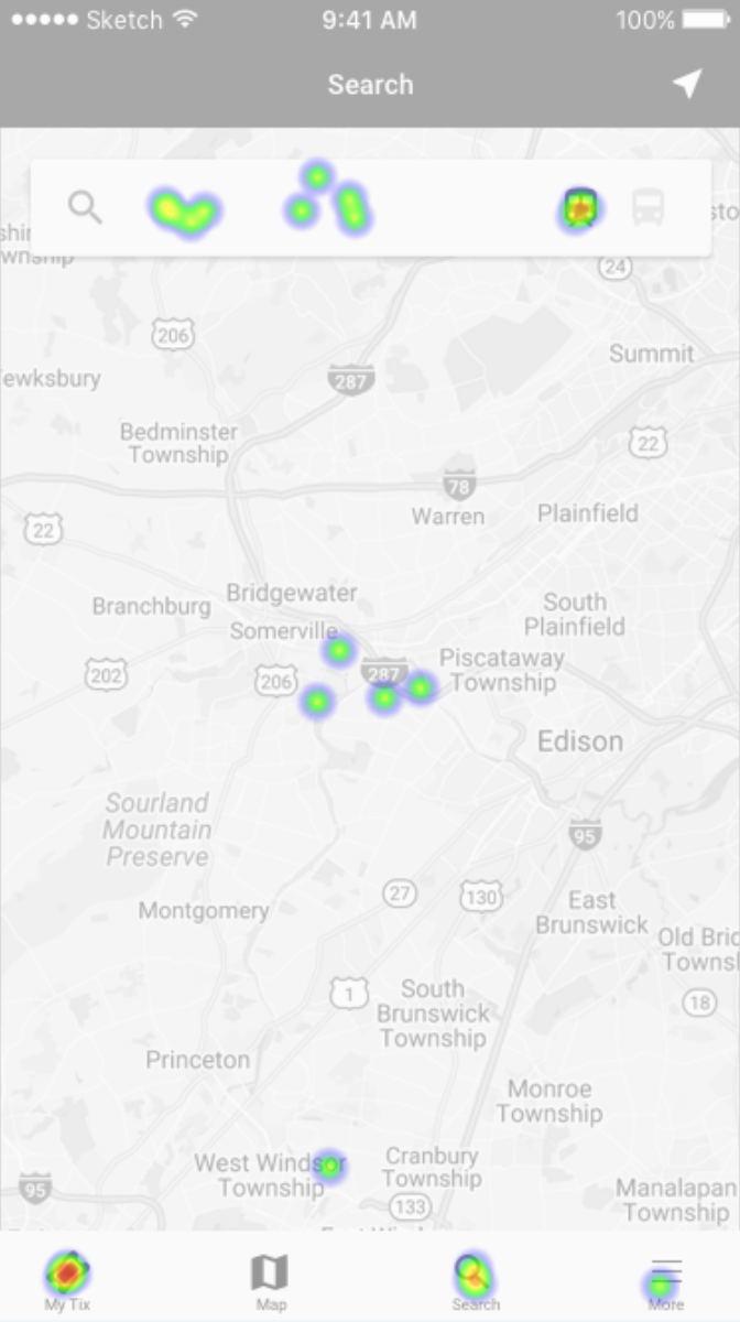
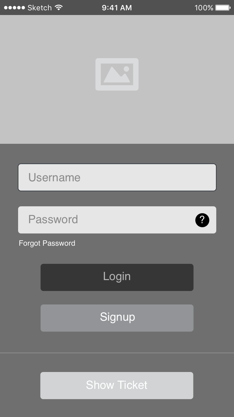
In order to validate the designs I created. I need to test them with real users. What I found was the first design I had, confused users with the language and terminology. Seeing the hot spots they clicked determined for me to make adjustments to the design.
Essentially, have two icons in the search menu didn't entice users to search for their station, as well as having "My Tix" as a language, which confused them to purchase tickets from that menu.
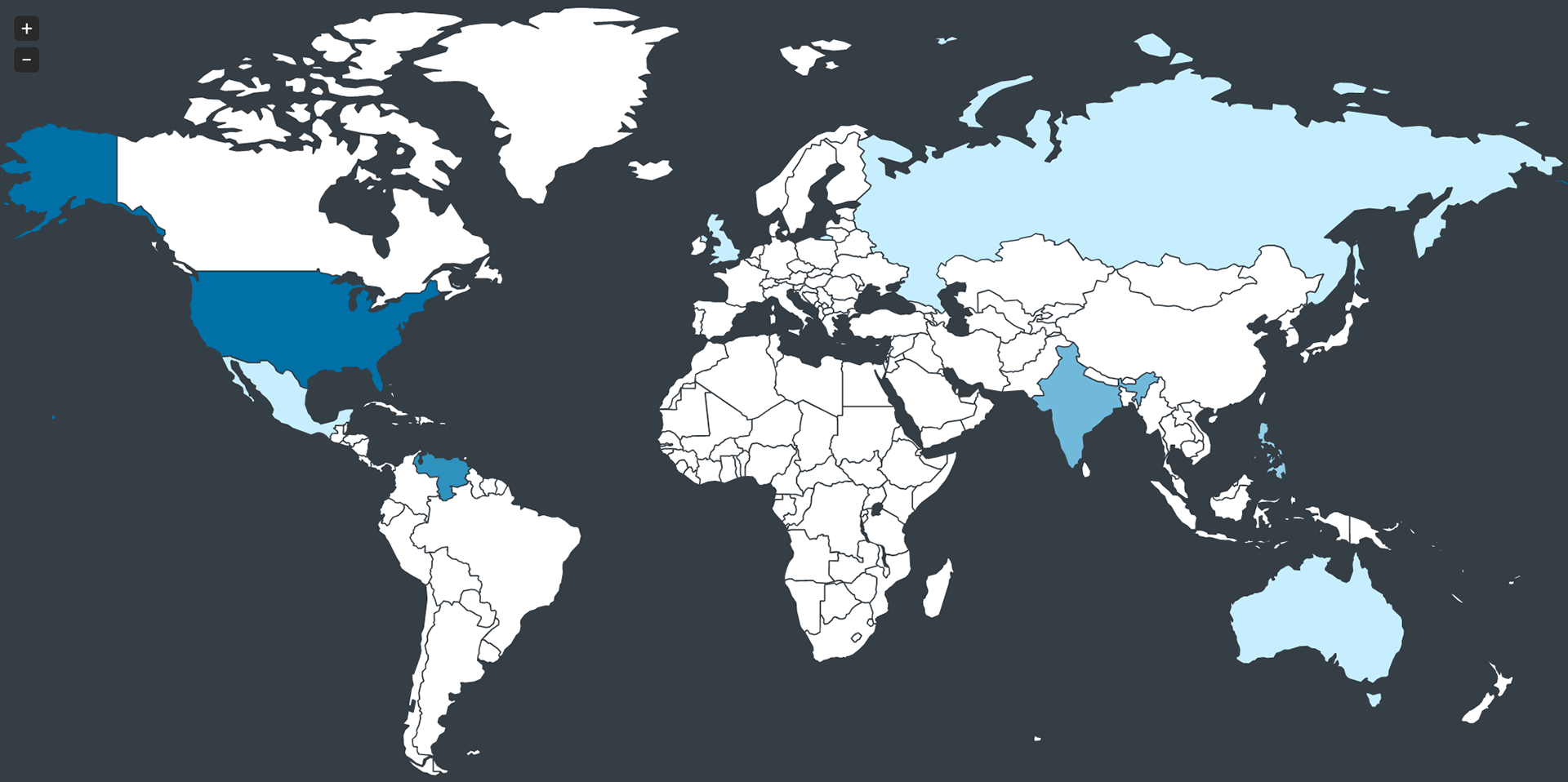
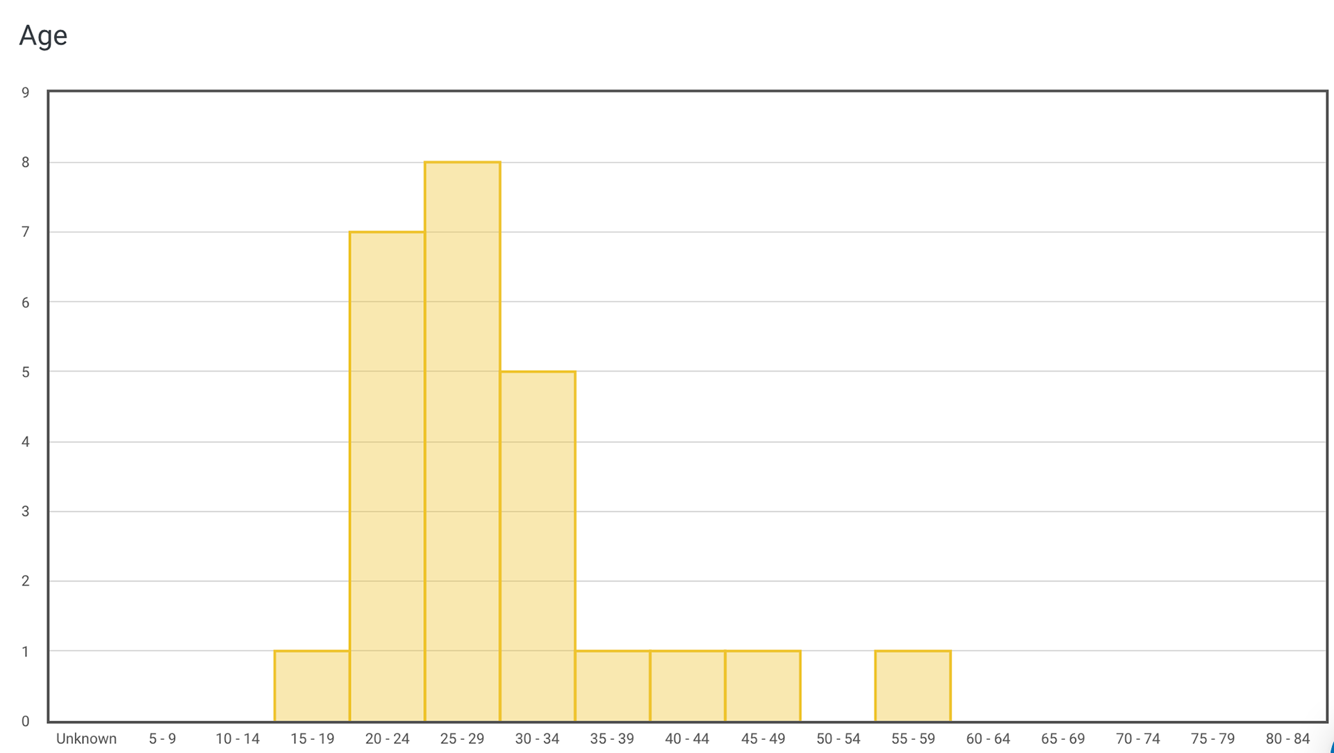
Users age ranged mostly from 20s-30s. All lived in a country with train transit.
WIREFRAMES
With this process, it gave a look at the application from a high fidelity stand point. The purpose was to study understand flow and functionality. After this we can test users to understand their habits and pain-points of the wireframe.
Flow One
WIREFRAME DESIGNS
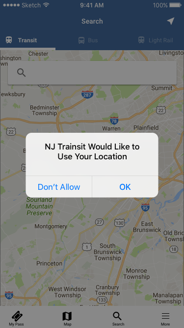
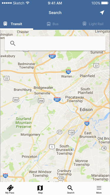
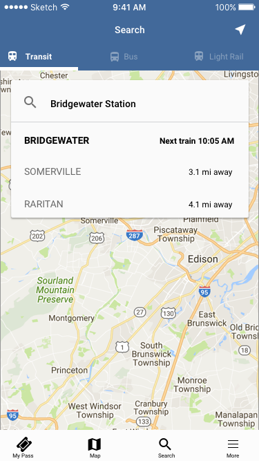
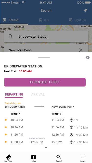
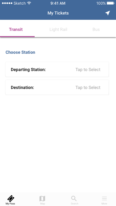
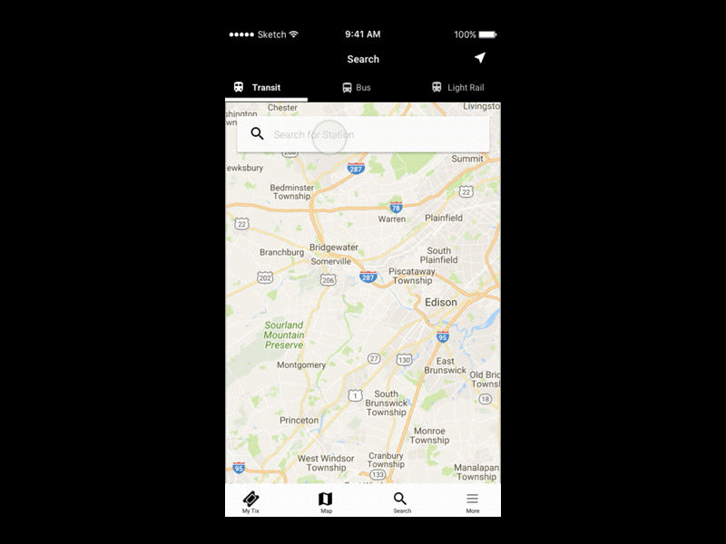
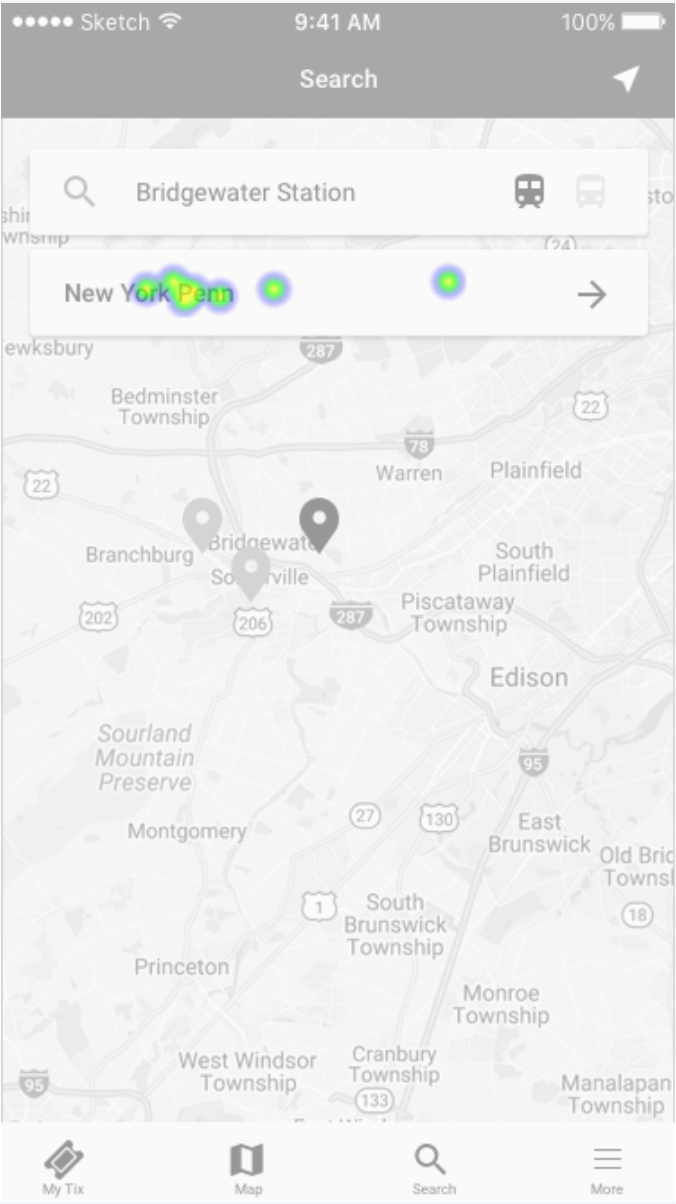
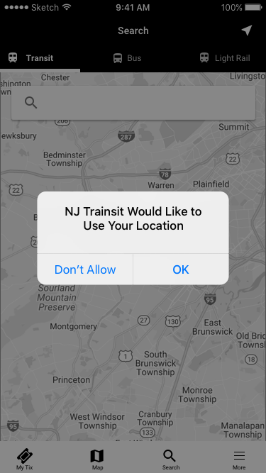
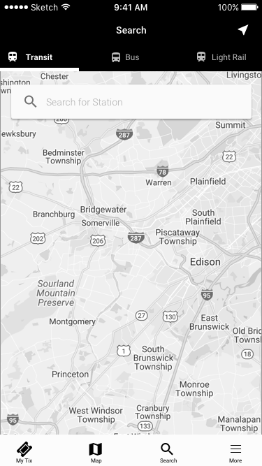
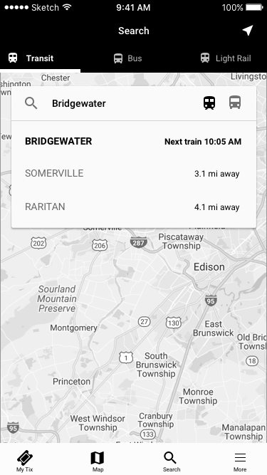
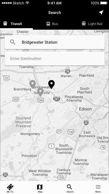
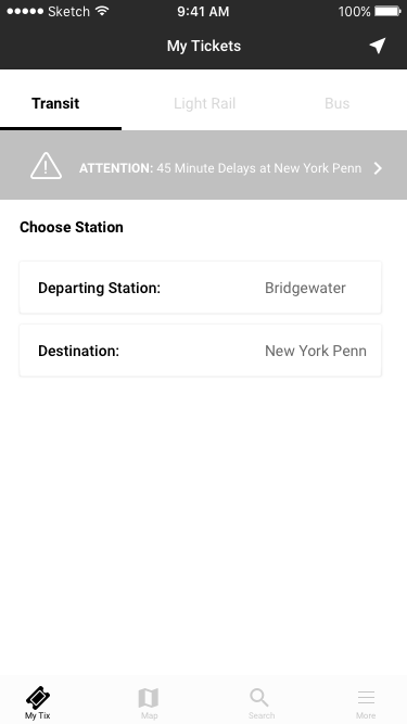
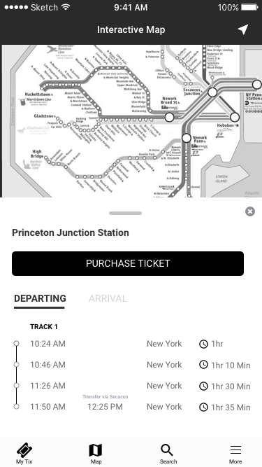
The first flow allows the commuter to select "Transit", "Bus", "Light Rail" in the header menu. This will give the commuter the opportunity to change search criteria.
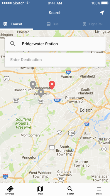
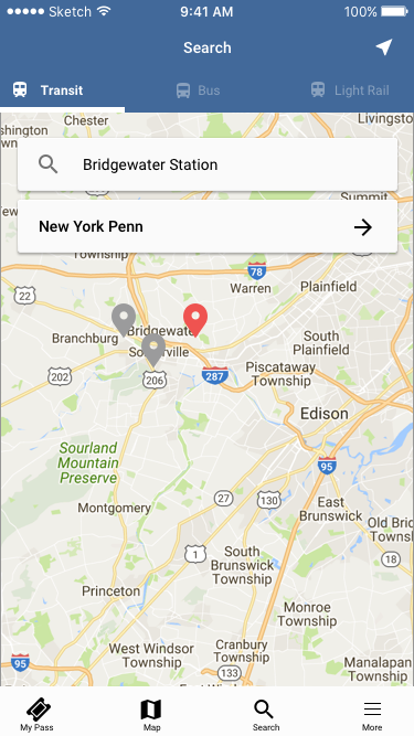
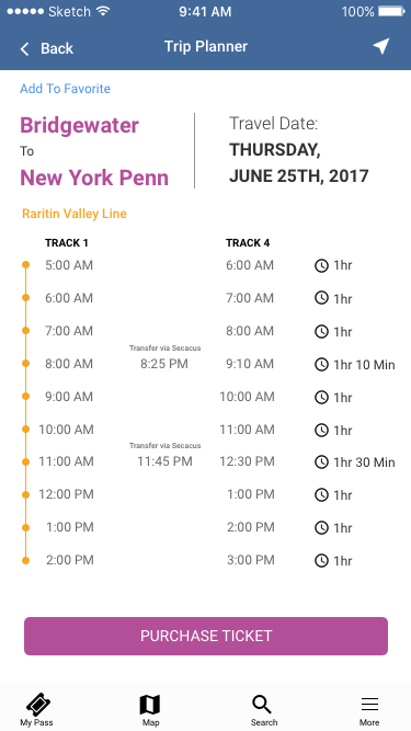
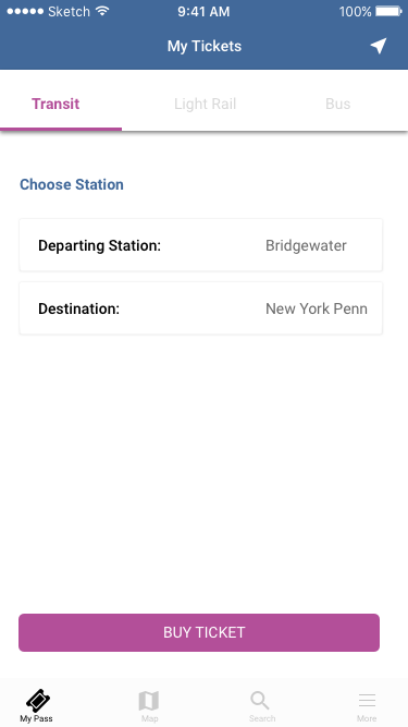
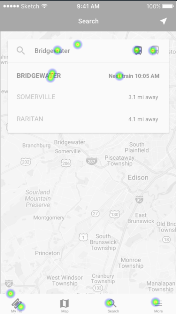
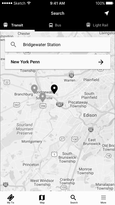
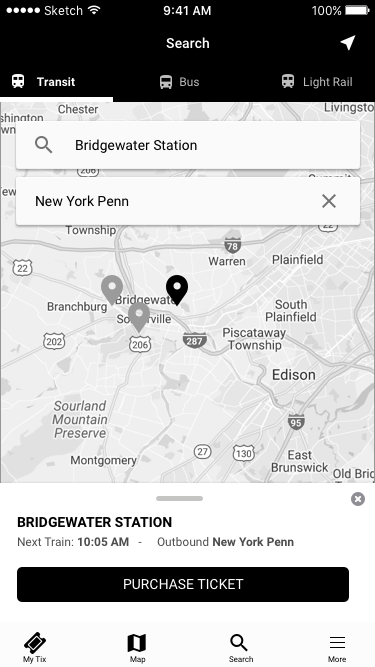
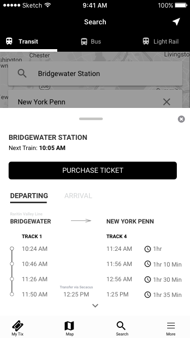
Once the commuter selects their search criteria (or category), they can than search for a station on the map. As you can see in the second screen (top row), the user is given near by locations, and the next train schedule based on the station they search. Once a station is selected, pins are placed on a map to indicate other nearby locations. A commuter can than enter a destination, hit the arrow to search, than is presented with a card listed with train times and track information. A commuter can either swipe up to see more times or tap on Purchase to continue onto the next screen.
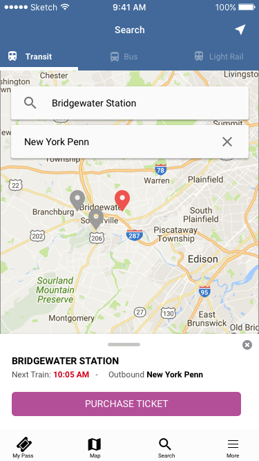
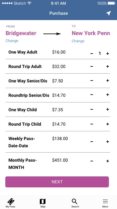
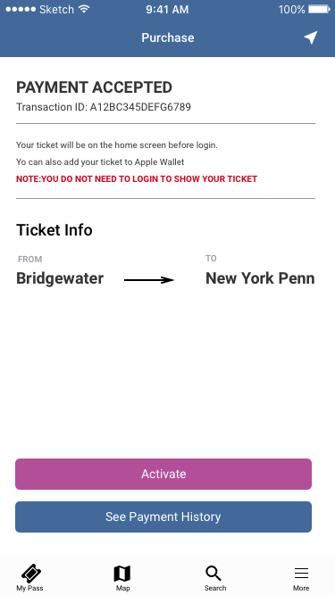
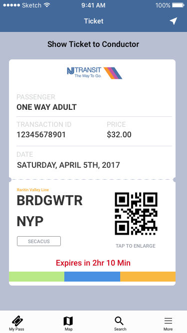
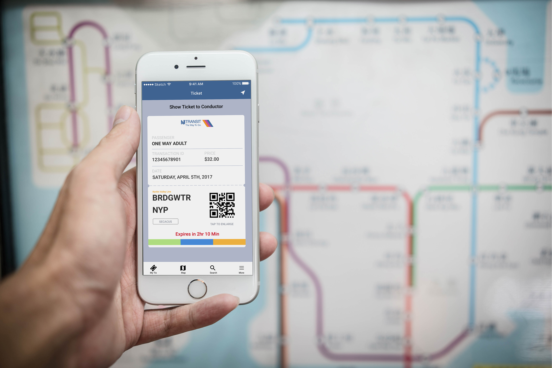
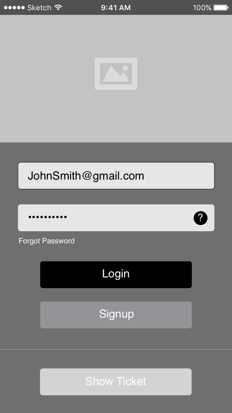
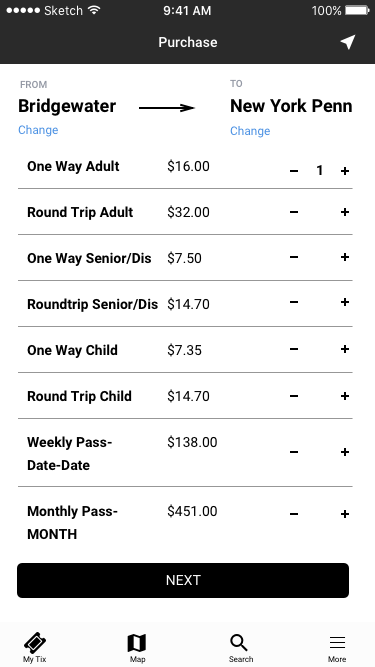
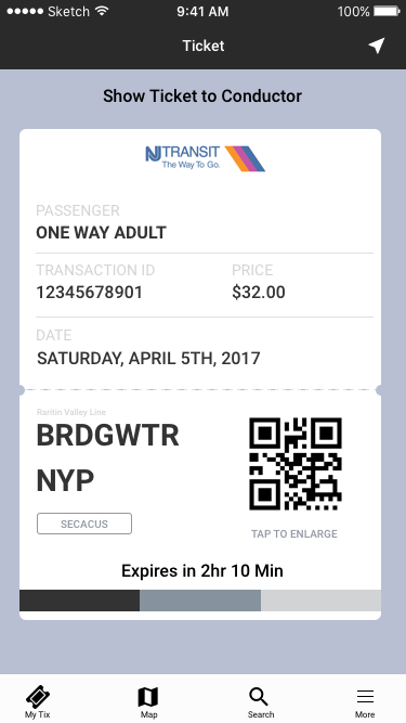
When a commuter selects their ticket option they are brought to a screen to show them they have purchased a ticket from Bridgewater NJ, to New York Penn. They can change their station stops if they wish before purchasing, this will change the price without making the commuter start the flow all over again.
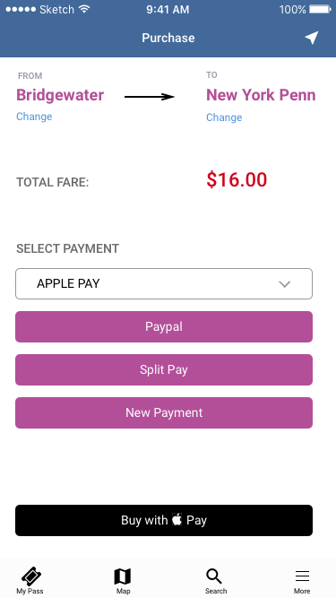
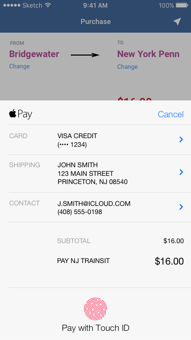
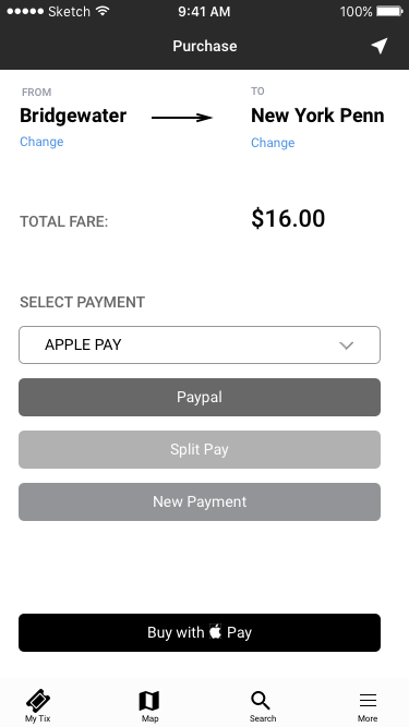
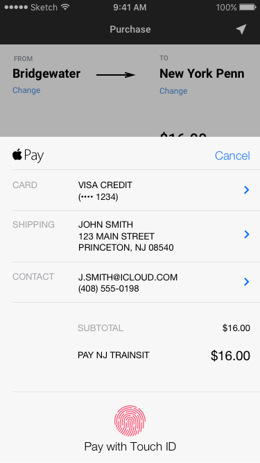
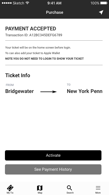
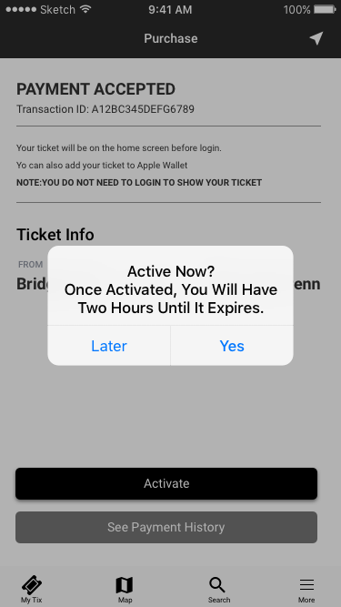
The payment system is split into three categories. All are taken from the current apps payment structure, except apple pay. I added apple pay so it will make it easier for the user to pay by touchID rather than a two or three step tapping process. Once a payment is accepted you have the ability to activate it, or see payment history. If activated you're taken to the ticket view. The bars at the bottom of the ticket will flash for 2hrs and 30min. This is keeping whats currently in the app.
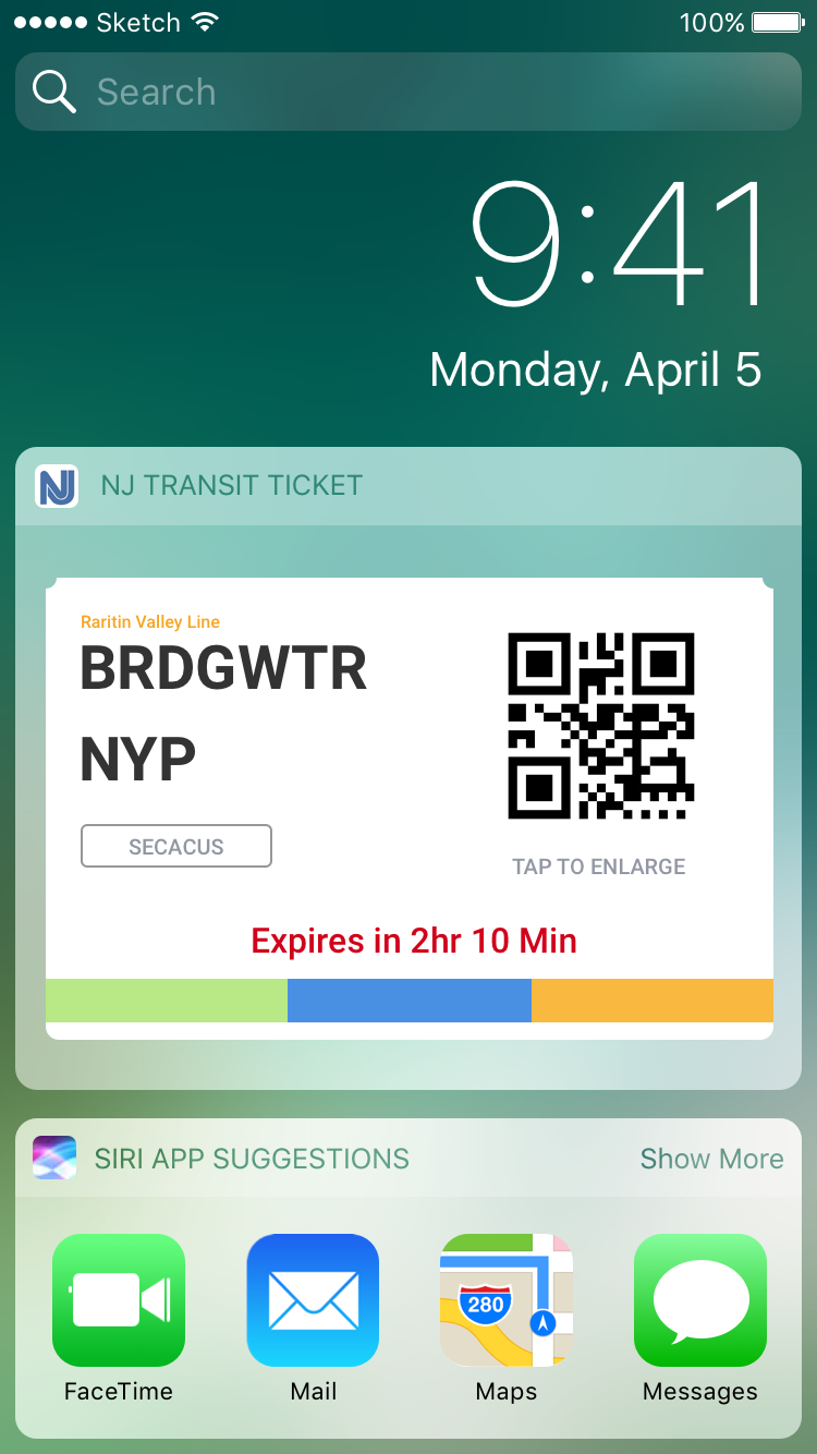
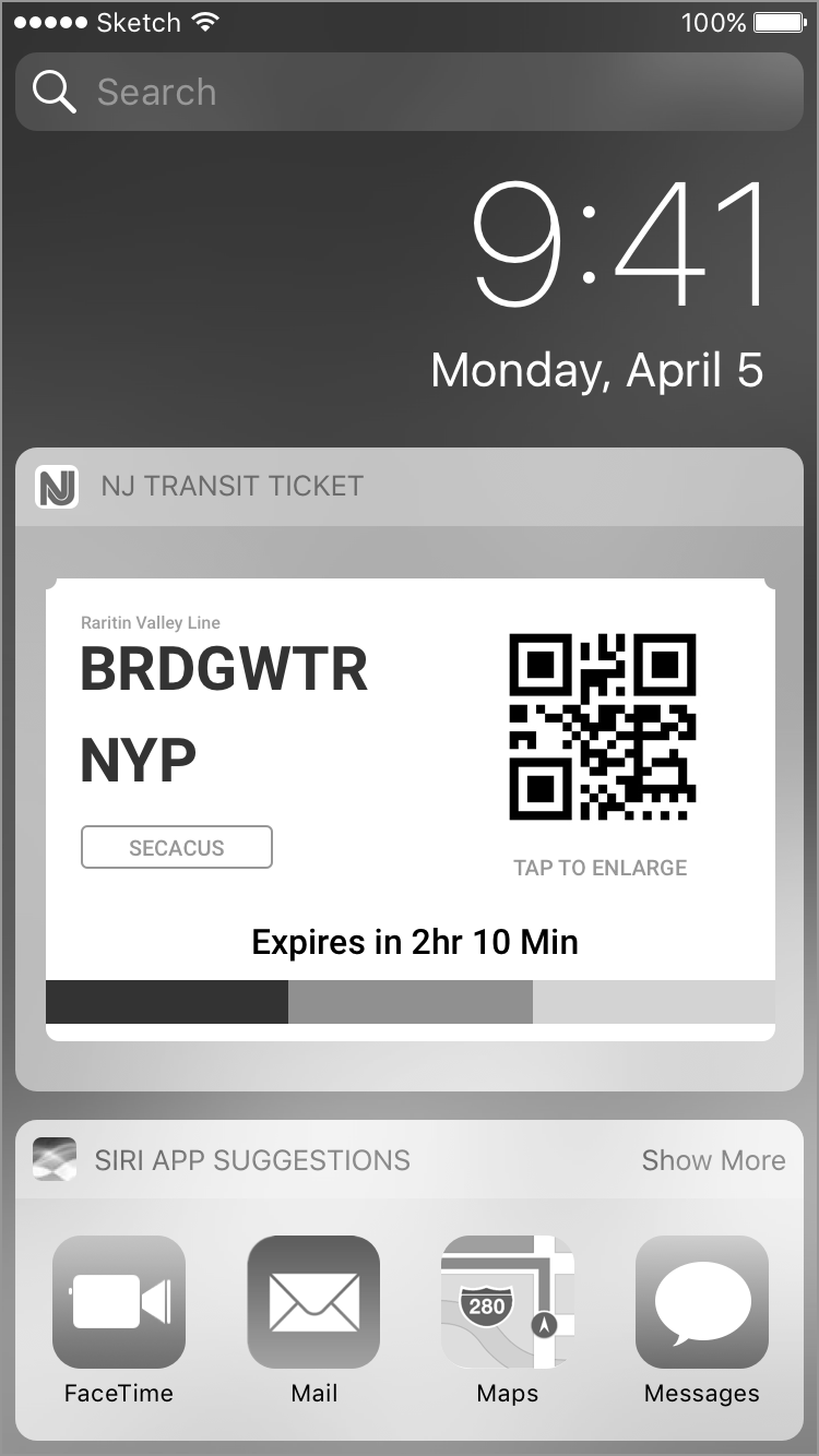
The commuter also has the option of viewing their ticket in their notification screen. This solves the problem of the "disappearing ticket or loading wheel" when you unlock your phone to pull the ticket up.
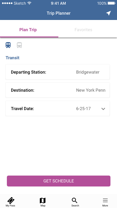
Flow Two
WIREFRAME DESIGNS
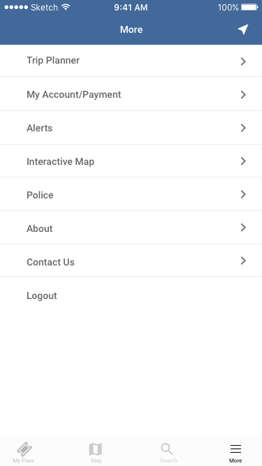
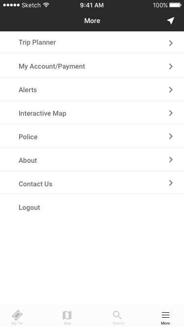
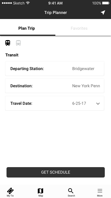
For the second flow a commuter can access the "Trip Planner" from the more menu. I felt having the secondary elements in the more menu was appropriate to offset the more important touch point at the bottom navigation.
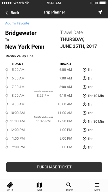
Once the commuter selects Trip Planner they have the ability to select their stations and departure date. This could be weeks from now or months from now. The commuter is than brought to a list of times for that date. They can than go forward and purchase a ticket for that trip. However, the time and date doesn't matter, because when you purchase a NJ transit ticket from point A to B it will be valid with no expiration date. The commuter just needs to activate it at time and date of departure.
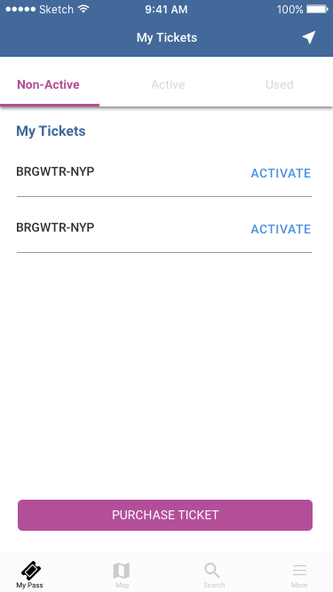
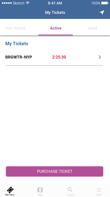
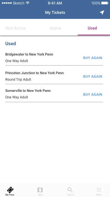
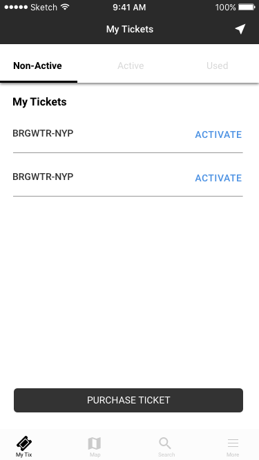
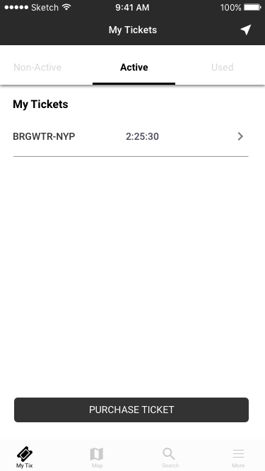
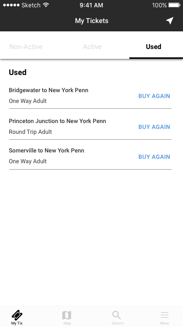
On the second row of screens, if the commuter selects the My Tix (Currently changed to My Pass) the commuter has three options to choose from.
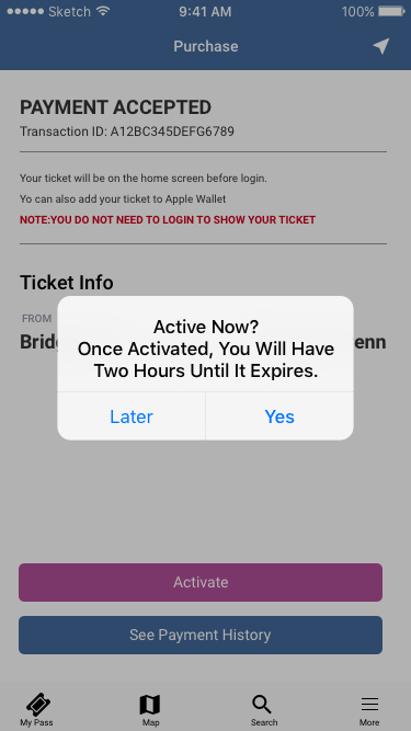
Non-Active Tickets- The Commuter can see how many non active tickets they have in their library. By tapping on activate the ticket will warn the commuter that once activated they will have two hours and thirty minutes until it expires.
Active-An active ticket shows you the timer count down until the two hours and thirty minutes ends. You can tap on the chevron to go to your ticket to show it, or lock your phone and it will show up in the notification menu.
Used- This screen shows a history of all tickets used. A commuter can tap on Buy Again to repurchase that trip. It will than bring them to the total amount due screen and they can use their Touch ID to purchase again.
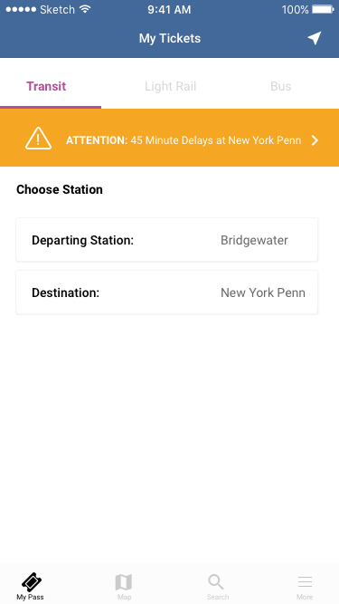
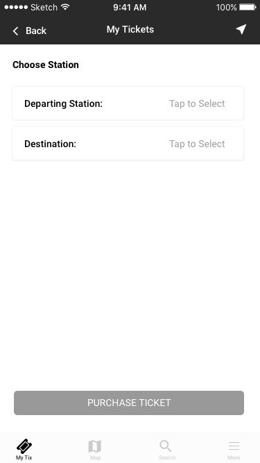
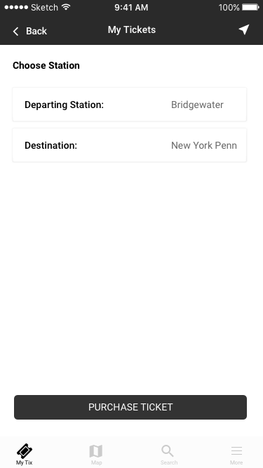
On the third row of screens a user can select and purchase tickets after selecting purchase ticket from the second row. Once that is done the user has to select both station to continue on. The third screen represents an alerts banner, to give commuters instant access to real time alerts. They can also access alerts via the more tab in the bottom menu.
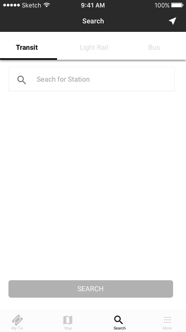
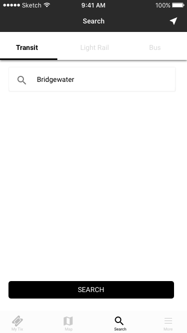
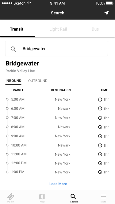
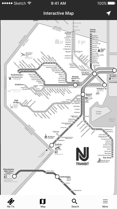
Flow Three
WIREFRAME DESIGNS
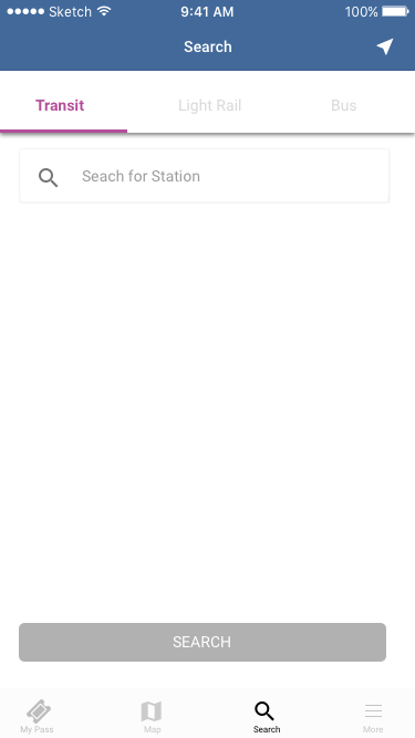
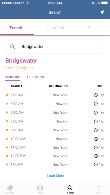
For the final flow, a commuter can tap on search at the bottom navigation menu. when tapped on, they are taken to a search screen for transit, light rail and bus. They can search for a station and get information for inbound and outbound trains. A list of times is pulled up with a continuous load to load the next batch of times.
The final two screens are interactive. A commuter can tap on the map, at any station and the same functionality will appear just like in the normal map.
NJ TRANSIT APP
The NJ transit app is a application that allows commuters to purchase tickets, track train schedules, stay up to date on alerts, and plan a trip.
The app allows users to save time, hassle, and keep all their ticket purchases available on their mobile devices.
I stayed within the brand guidelines, using the NJ transit color pallet For Buttons, styling, and states, I used Google Material Design heavily for the bulk of the visual design, while adding some of Apple's Human Interface Design rules as well.